Skip to 💨
About the project
As Africans, we grew up eating different African cuisines, but now they are often under-appreciated, unfindable, and not given enough recognition. Developing a simple way to locate restaurants that sell African cuisine is long overdue. For Dufuna’s Design task powered by UK-Nigeria Tech hub, I researched what users feel about African cuisine and developed wireframes for an app that help users find and book reservations in African restaurants. I did everything from the first stage of the design process (Understand) to the last (Prototype).
The process
I was eager to begin this task because this was my first. I designed an online solution for African Food Incorporation ( AFI – a chain of African restaurants) that helped customers find restaurants and book reservations.
And so I began with a pen a paper, planning, establishing the design process, building the foundation for the task. And returning to it each time I got stuck.
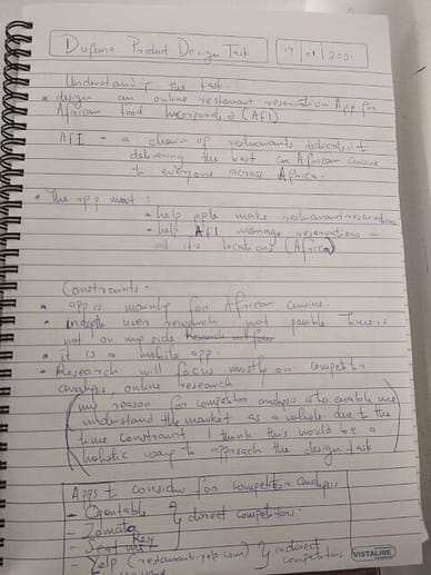
The first challenge I encountered was choosing the design process to use. With barely a week to spare, I settled on using Google’s design sprint because although it is for teams, its quick pace and attention to detail helped me meet the deadline.

Understand
My research centred on competitive analysis, user reviews of competitor apps and user interviews. The competitive analysis examined five competitor applications – OpenTable, Zomato, Resy, Yelp and Foursquare – three were direct competitors while two were indirect. I felt a competitor analysis was the best way to approach the task holistically since I did not understand how reservation systems worked.
I also interviewed two users and gleaned user reviews of competitor apps. My user research focused on the users’ workplace, how they choose restaurants, and what they think about African cuisine. Interestingly, I found that the users I interviewed felt that people looked down on African cuisine.
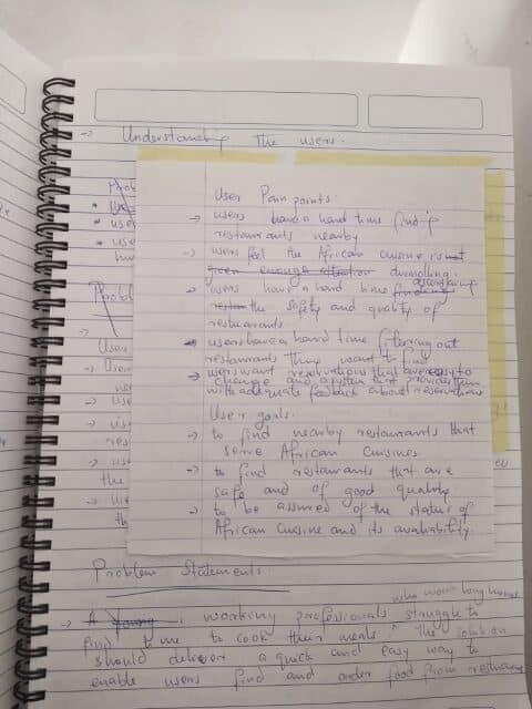
Nonetheless, I deduced User Pain Points, Goals and Personae.
Pain points
- Users have a hard time finding restaurants nearby.
- Users have a hard time ascertaining the safety and quality of restaurants.
- Users have a hard time filtering out restaurants.
Goals
- To find nearby restaurants that serve African cuisine.
- To know when users have made a reservation.
- To find restaurants that are safe and of good quality.
- To find restaurants with a simple filtering system.
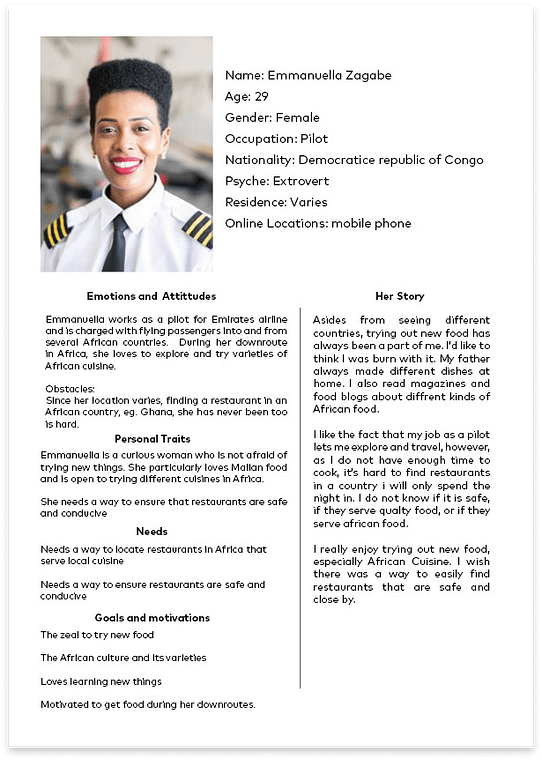
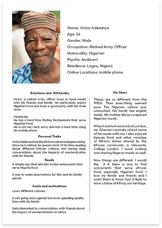
Personae
Sketch
This was my favourite part of the process. I returned to my notebook to sketch solutions. It helped me iterate and weigh each option carefully. During this stage, I had my personae in mind: What would Emmanuella want to see? How would Victor perform a task with the solutions I am proffering?
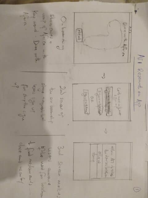
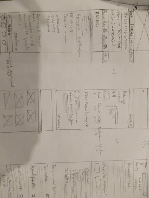
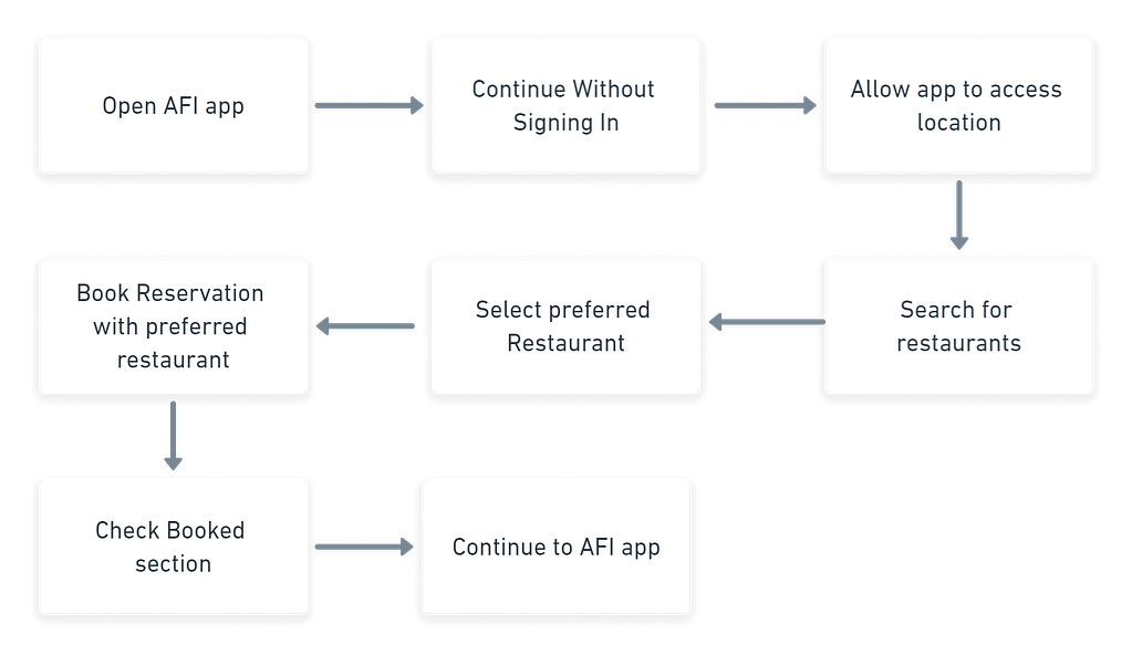
Asides from the sketches, I created a task flow. It allowed me to focus on how users would reserve a restaurant table via the AFI app.
Decide
Here comes the solution stage. I tried as much as possible to ideate numerous solutions.
It turns out that while I designed the solutions, I found myself going back and forth, asking myself if my whole process made any sense. I became confused, probably overwhelmed by all the detail needed to make this work. But I had my notes and research to pull me out of that state. They helped me a lot.
Eventually, I designed four solutions to address Emmanuella’s and Victor’s problems.
Solution 1 – Find nearby restaurants that serve African Cuisine
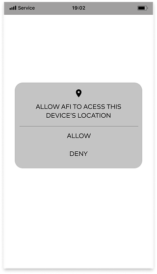
By including geolocation as a main feature of the app, users can find close-by restaurants quickly.
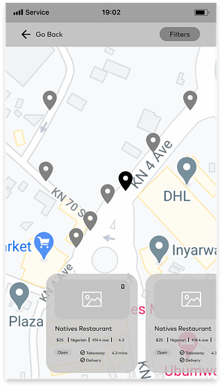
Users are now able to find restaurants that serve African cuisine with google maps. For easy access, I designed a nearby option located in the navigation bar. Users can easily access restaurants according to their location.
In addition to this, the description of each restaurant contains its distance from the location of users.
Solution 2 – Allow users know when they have made a reservation
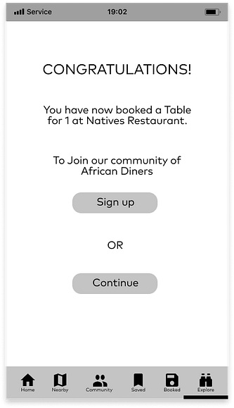
To enable users to know when they have made a successful reservation, I designed a feedback screen that pops up after users have booked a reservation with the AFI app.
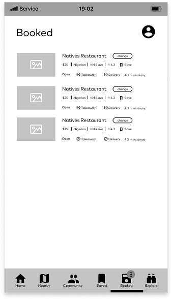
Users can select the booked option in the navigation bar which allows them to see and change all reservations they have made. e and quality restaurants.

Users can find safe restaurants through user reviews written by members of the community. On the home screen, users have access to restaurants approved by the AFI community (users signed into the app). I labelled this “The People’s Choice.”

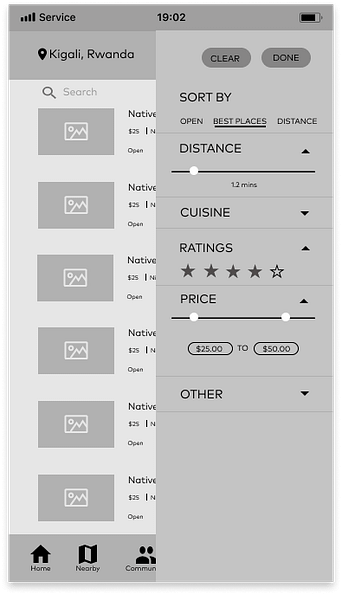
Users can also filter out restaurants based on their reviews and ratings before and after they search for restaurants.
Further, on the restaurant’s profile page, users can see ratings, reviews, and a summary of all reviews users have given a restaurant.
Solution 4 – A simple filtering system
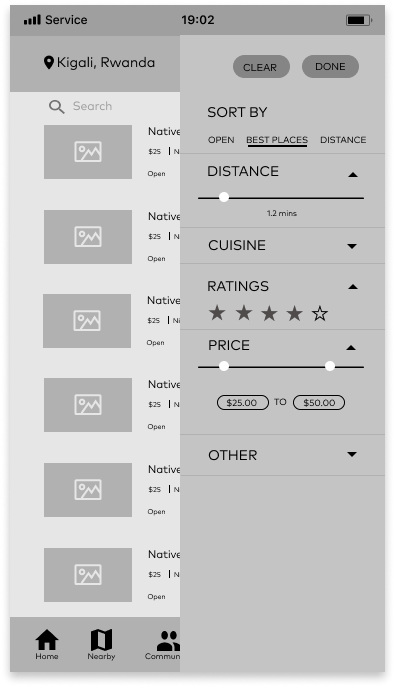
The app allows users to filter restaurants in different ways. There is a filter button located at the top of the results page that enables them to filter out restaurants based on ratings, distance, price, cuisine, best places, open places and other options such as the ambience, facilities, etc.
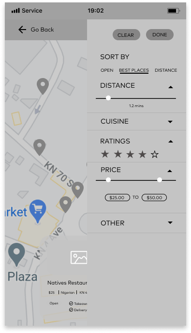
The nearby option in the navigation bar has a filter button similar to that on the results page.
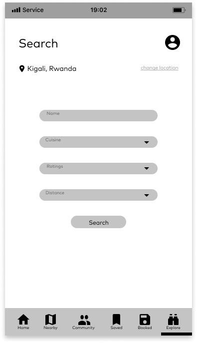
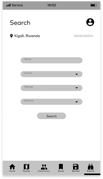
The search option in the navigation bar allows users to filter out restaurants based on ratings, kind of African cuisine, name of the restaurant, and distance.
Prototype
For the last stage, I created an interactive prototype to help users simulate the task. You can view full prototype here.
Conclusion
Considering that this was the first time I took up a design task after spending months dousing myself in the fundamentals, I learnt so many things. I learnt to make decisions according to user needs, I learnt to empathise with users, and I learnt to question my assumptions.
Unfortunately, my application was rejected. But I do not mind. I learnt to enjoy the process of creating a solution for users. I enjoyed the granularity and diving into the nuance of understanding how users think and feel about reservations. And I want to do more, I want to get better at researching, empathising and understanding that good design is more than designing pretty interfaces.
