TL;DR
- Problem: WorldCitizen aimed to encourage Nigerians to donate their unused clothes rather than disposing of them in landfills. They needed to understand how Nigerians handled their unused clothes. They estimated that two-thirds of the total amount of purchased textiles in the last two decades (100 million tonnes) ended up in landfills.
- Role: UX Researcher.
- Team: 1 UX Researcher, UX Designer, & UI Designer.
- Duration: 3 weeks.
- Approach: I was the only UX Researcher for this project. I conducted five user interviews and an unmoderated usability test with 10 participants.
- Discovery: I found that participants saw donating clothes as a duty but hardly donated to charities because they were inaccessible. Some participants feared donating to unknown people for religious and superstitious reasons.
- Outcomes: I recommended enabling donors to locate beneficiaries via geolocation, informing them about the status of their donations and rewarding them with points for donating their clothes. My recommendations were implemented in the final solution and ramped up my grade to 97%.
Skip to 💨
Revving the engine
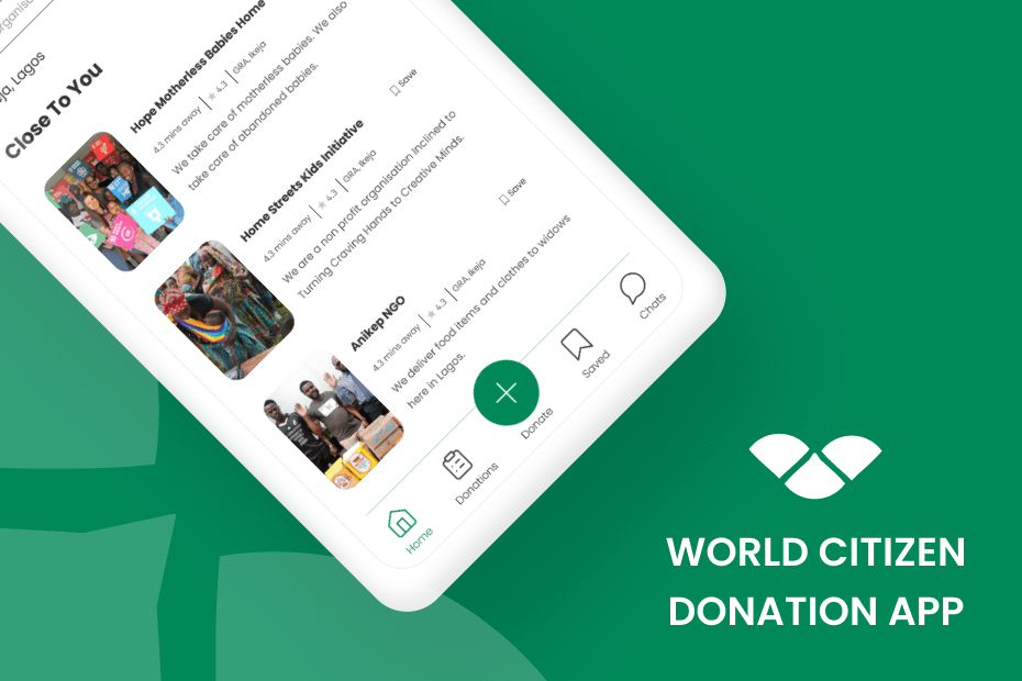
I had just begun the training phase of Zuri’s internship and was eager to get my hands dirty. My first project was to design a donation app for WorldCitizen, a humanitarian organisation.
Goal
To encourage and help Nigerians within Nigeria to donate clothes to those who need them and to make donating clothes trendy.
WorldCitizen estimated that the global annual consumption of textiles per person increased from 7 to 13kg in the last two decades, reaching 100 million tonnes. But, two-thirds end up in landfills.
The goal
Note
WorldCitizen needed to learn about how Nigerians handled their old clothes in order to figure out ways to encourage donations.
The objectives:
- Identify how people handled their old clothes.
- Identify the factors people considered to donate their old/unused clothes.
- Reveal the current frustrations Nigerians faced when donating their old/unused clothes.
Improving the donation process
A broad segment
WorldCitizen hoped to increase donations amongst Nigerians. So, I knew I would be dealing with a broad segment. I decided to focus on those who donated clothes and leave room for those who didn’t to learn about their attitudes toward clothes. Now, this was a vast segment, but the research was generative; there were a lot of unknowns and grey areas and at this point, it was hard to narrow down the segment.
What is it about donations?
At the initial stage, I chose to conduct 5 semi-structured interviews since WorldCitizen wanted to learn about how Nigerians handled their clothes. Later, I carried out 10 unmoderated usability tests to ascertain the solution’s success.
Note
Conducting interviews during the discovery phase seemed like the best bet because it helped me generate insights about people’s donation behaviours or a lack of it. The interviews centred on their feelings about clothes and giving them out. Each session lasted between 30-40 mins.
Donation is a duty, but…

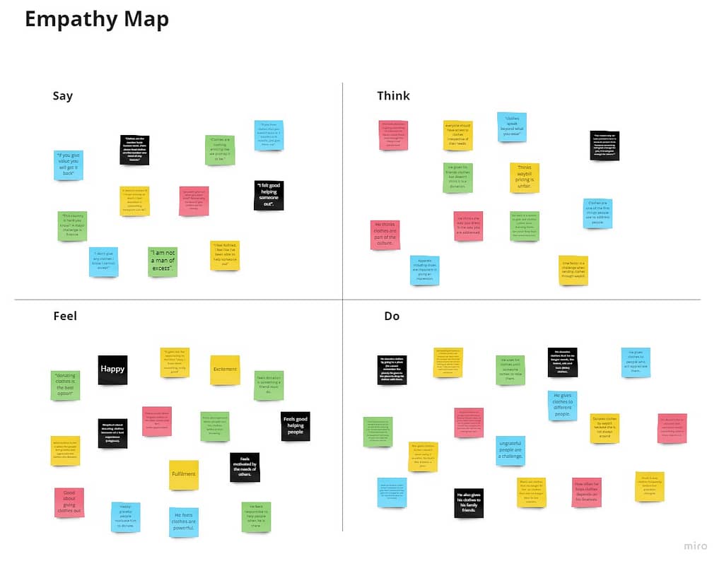
After the first round of data collection, I analysed the data through empathy mapping and an affinity diagram.
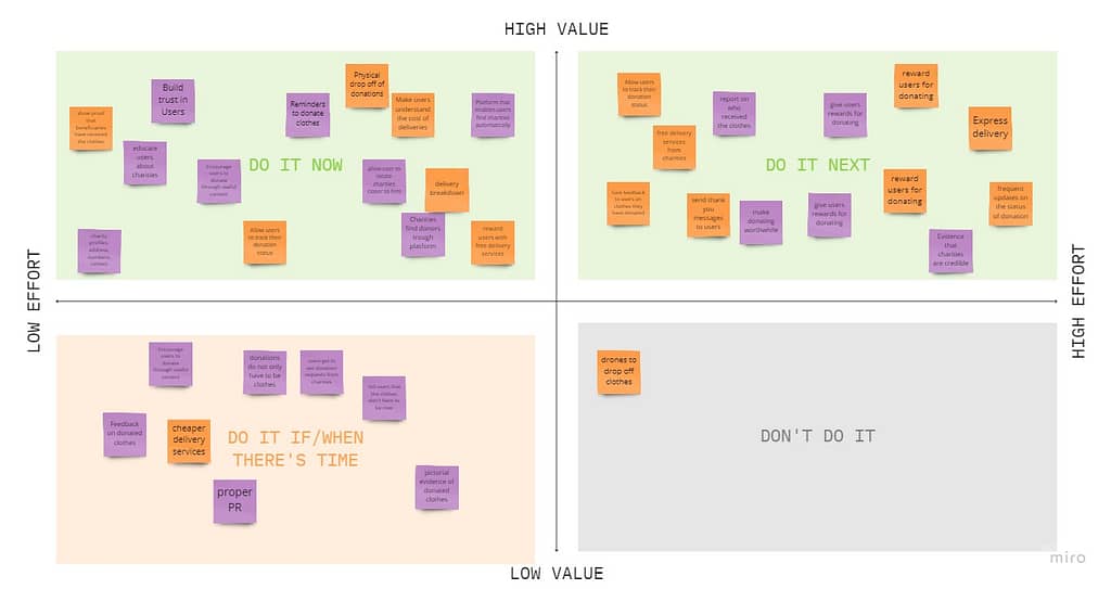
The major insight was that most participants saw donating as a duty but failed to do so because trustworthy charities were inaccessible. I found a gap between donors and benefactors and this showed in my personas. A few did not donate for superstitious and religious reasons. Each persona let me prioritise my ideas — ideas that specifically targeted their problems — with a priority grid.
Insights and recommendations
Insight
I found that participants saw donating clothes as a duty but hardly donated to charities because they were inaccessible. One’s background, ideologies and surrounding environmental factors affect their decision to donate clothes.
Findings
- The amount of time it takes for a donation to reach its destination is time-consuming and discouraging.
- Organisations and beneficiaries that accept donations are difficult to find.
- Delivery prices hamper the zeal to donate clothes
- People fear donating clothes to people they do not know for religious or superstitious reasons.
- Thanking donors encourage them to donate more.
Recommendations
As a result, my research recommended 10 features:
- Provide a breakdown of delivery costs
- Locate organisations with google maps and filters
- Track donation status
- Receive, accept or reject donation requests
- Flexibility to donate onsite or through delivery
- Organisation profile containing work they have done, testimonials, ratings.
- Ability to make a donation
- Reward points for donating clothes (pay for delivery with those points).
- Communicate with organisations
- Donation prompts and reminders
Research deliverables
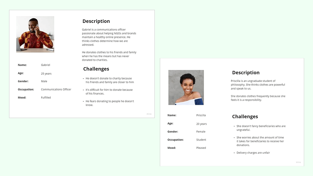
Personas: The personas served as a summary of my potential users. From this point onwards, my research focused on what Gabriel and Priscilla would love to see.
Empathy map: The empathy map allowed me to understand that donation was a duty to the participants and that their background, ideologies and surrounding environmental factors affected their decision to donate clothes.
Priority grid: I triaged my ideas using a priority grid and focused on the “high value/low effort” quadrant.
Reinventing the donation experience
For each wow feature I generated a user flow and user journey map. I created digital sketches of each flow. I converted these sketches to low and high-fidelity prototypes.

Challenge
These deliverables helped to determine the main navigation and interactions of the app. The prototype stage was by far the most difficult. I found myself going back and forth between the prototypes and the sketches, trying to perfect the solutions. The process became iterative, and I found out that I needed to modify some of my decisions in previous stages.

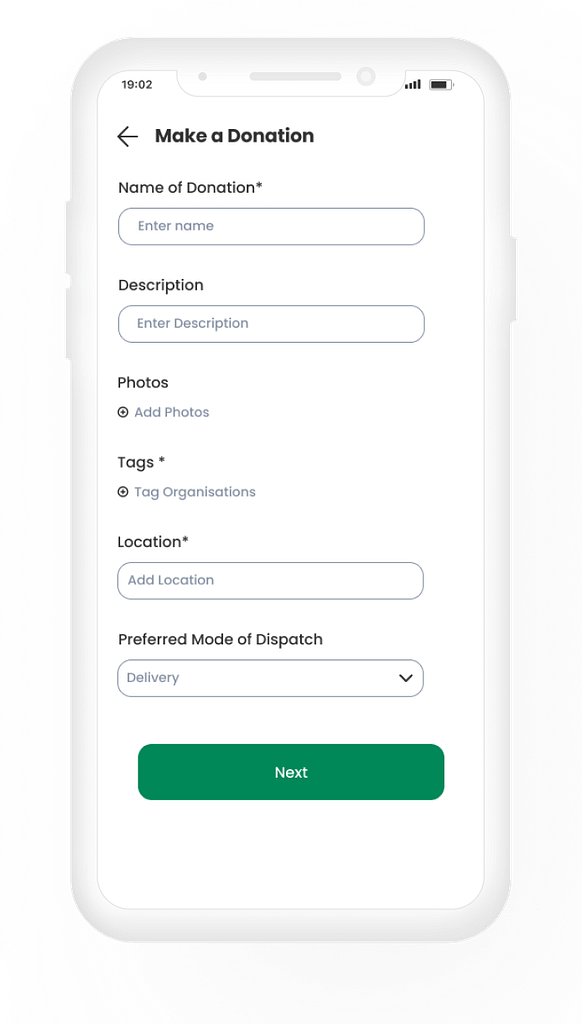
Make a donation
The outcome for the prototype stage was the high-fidelity prototype of which its primary aim is to help people donate their clothes.
Problem: Inaccessible Organisations/Charities
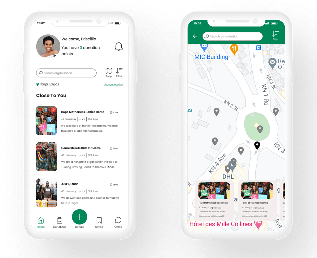
Geolocation
Geolocation of organisations/charities with GPS. Users can locate organisations nearby with their GPS.
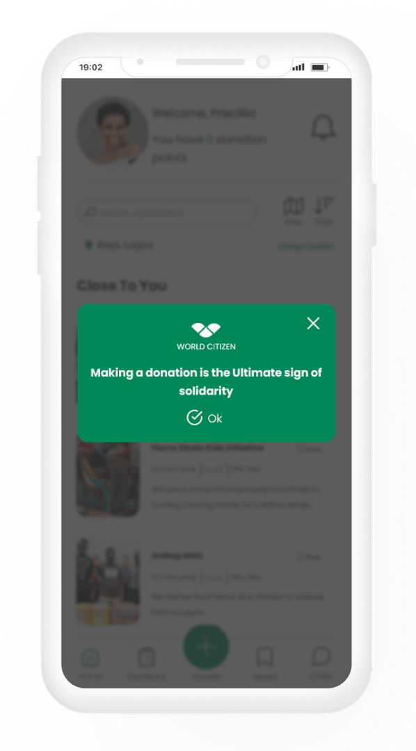
Daily prompts
Users receive daily prompts triggering them to donate.
Problem: Lack of Funds & Unfair delivery prices
You can call this killing three birds with one stone. I found that solutions geared towards solving the users’ financial problems also apply to solving the problem of unfair delivery prices.
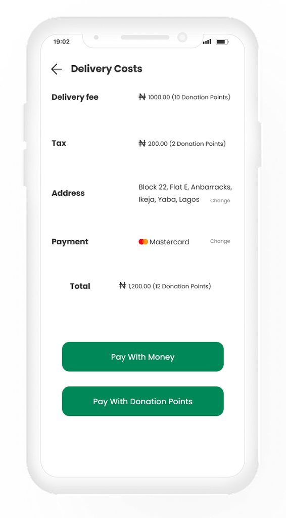
Delivery cost breakdown
Users receive a breakdown of delivery costs. This will ensure that users understand the cost of deliveries.
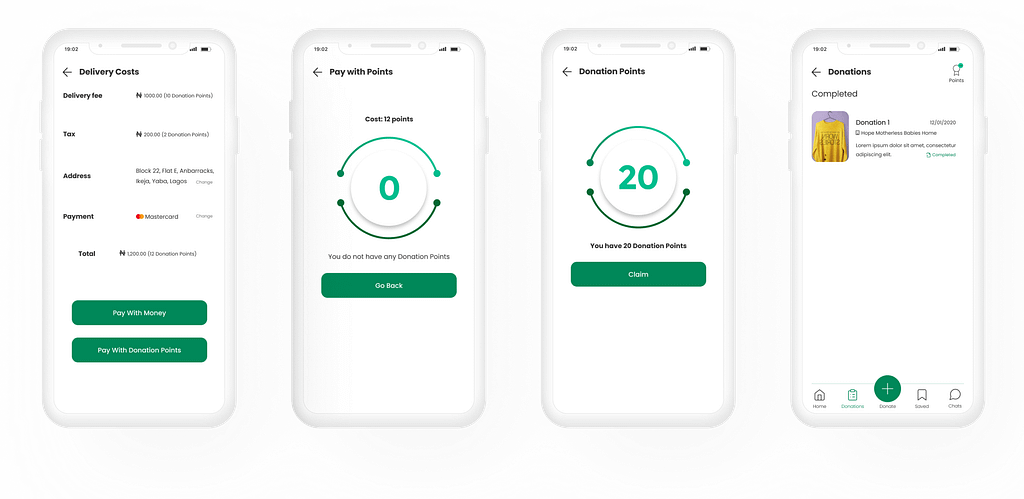
Donation points
Users receive a breakdown of delivery costs. This will ensure that users understand the cost of deliveries.
More delivery options
Users can choose to deliver their donations physically or through a dispatch rider with the donation form. If users see the breakdown of costs and do not have the funds, they can donate physically.
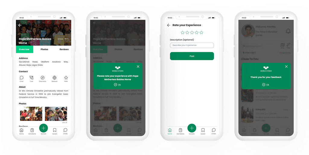
Feedback about organizations
Users can give feedback after they have donated to a particular charity.
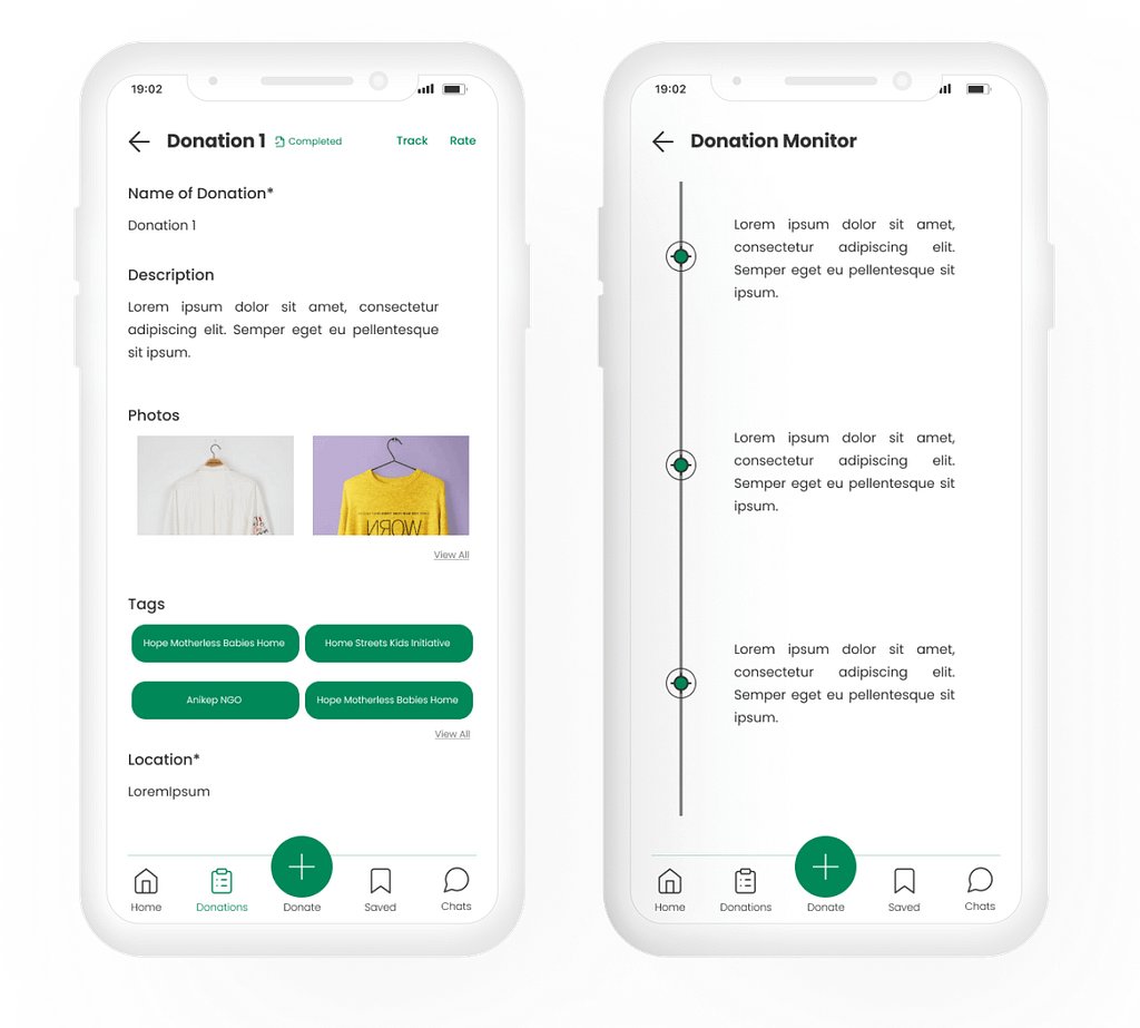
Problem: Excessive time is taken for donations to get to beneficiaries.
Donation tracking
Users can track their donation’s status.
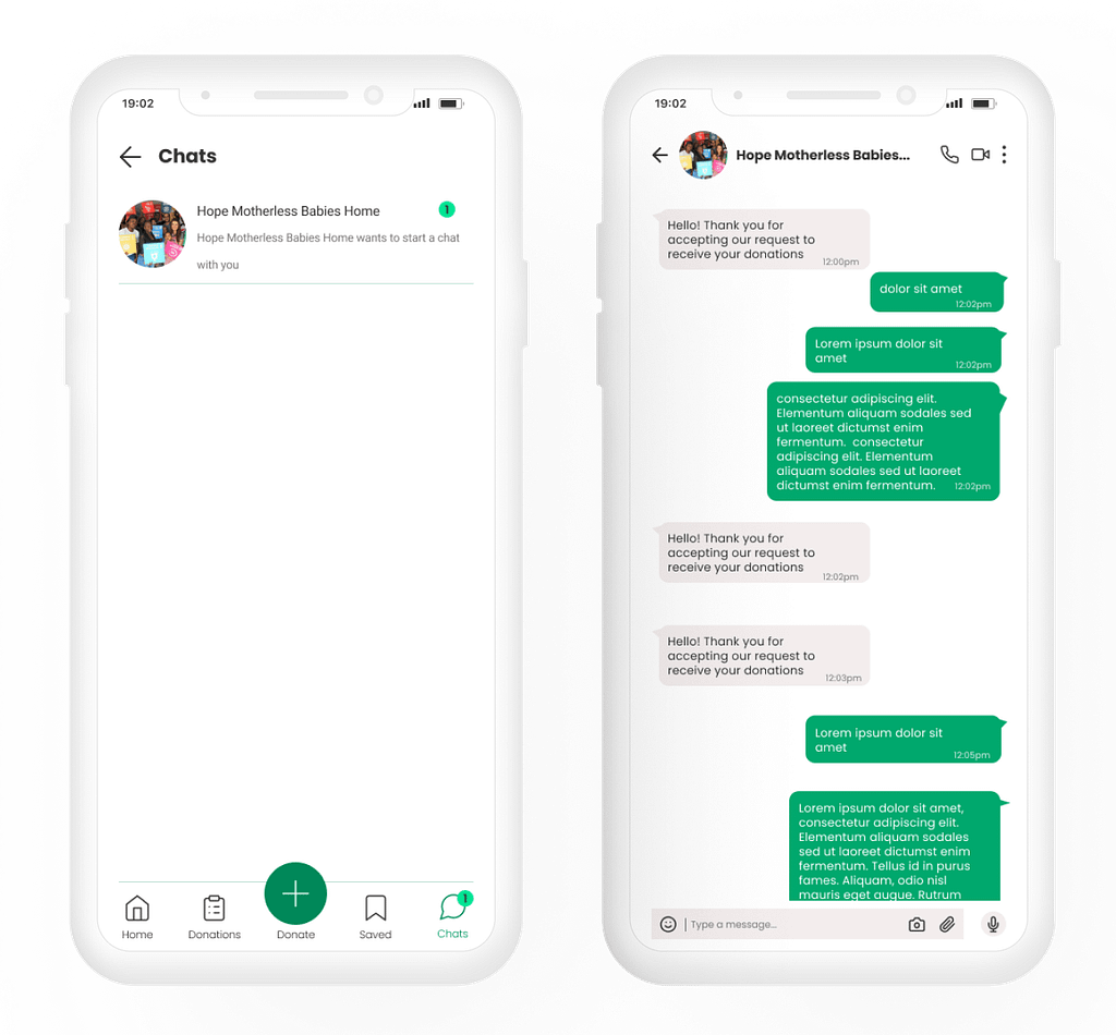
Problem: Ungrateful beneficiaries.
Chatting with organizations
Users can receive feedback from charities through the chat feature.
Unmoderated tests
Finally, I conducted 10 unmoderated usability tests with the prototype. I asked each participant to perform one task: make a donation. Nonetheless, I could have gotten richer feedback if I asked participants to perform more tasks.
Test findings
Note
The test asked participants to make a donation with the Figma prototype and record their experiences, challenges and thoughts in a survey.
- 70% of test participants confirmed that they would use the product in real life.
- Most participants found the prototype to be simple, intuitive and hitch-free.
- However, the initial prototype did not allay the fear of donating clothes to unknown people and organisations.
Outcomes
97% out of 100%: The project was graded by the training coordinators. I topped the scoresheet of my assigned cohort with a score of 97%. This was a confidence boost and encouraged me to take on more challenging projects.
Challenges & lessons
Overall, improving the donation experience for a wide variety of users has led me to understand that most users see donating clothes as a duty. However, a gap exists between donors and benefactors. World Citizen attempts to bridge the gap, to make donating clothes trendy, cool and easy for everyone.
Iteration: Contrary to plying through a linear design path, one unique thing about research and design is that the process is hardly ever linear. I discovered, while working on this project, how iteration can be used to reshape design decisions.
Unmoderated tests could be better: The unmoderated test focussed on one task: to make a donation. While it gave me the insights I needed, I felt I could have gone deeper and explored other parts of the prototype. The test was limited to one task and now I see how the insights could have misled me.
