

Skip to 💨
About the project
She Code Africa’s annual mentorship program, cohort 4, is around the corner. For the beginner design technical assessment, the task was to recreate the dashboard design below originally designed by Emy Lascan.

SEE MORE
- Here is the source of the design
Here is my recreation of the dashboard design (my answer to the technical assessment):
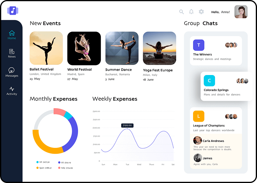
I took up the challenge, eagerly, hoping to pay attention to each detail of the design.
However, while designing, I couldn’t help but notice some flaws in the design. Since the assessment did not explicitly ask for corrections, I followed the original instructions of recreating the dashboard. But, I decided to suggest solutions to the problems I noticed in another design. I mean, going the extra mile wouldn’t hurt.
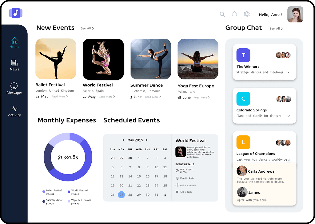
Here is my re-design of the dashboard (not the answer to the technical assessment, but my own redesign of the original dashboard):
The original dashboard design is for an event SaaS platform. It aims to help users book, manage, and discover events according to their preferences. It also serves as a psychosocial system where users can interact with other users having similar interests.
But I felt some elements in the original design were unnecessary to potential users and not friendly enough.
Problems & solutions
Inconsistent font-weights
The font-weight in the headings of the original design is inconsistent. In each heading, one word has light font-weight while the other has heavy font-weight.
According to gestalt principles in psychology, the inconsistent font-weights affects how users group elements in the interface. Users would group the words with a heavy font-weight as different from the words with a light font-weight.
Solution: The heading fonts are now consistent to enable users to group them.
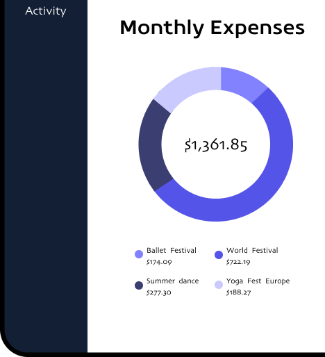
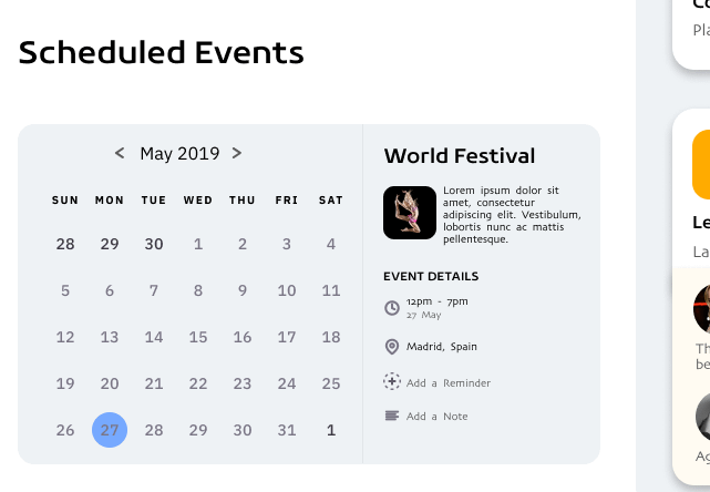
Charts
In the original design, there are two charts; a line chart and a doughnut chart. The doughnut chart is incomplete. It does not form a complete circle. Not only is it incomplete the data in the doughnut chart is not visualised well. For example, according to the original design, the value for the US is $722.19. However, the doughnut shows the US as the smallest amount the user has spent.
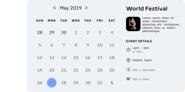
Solution: I redesigned the doughnut chart and replaced the line chart with a calendar. The doughnut chart now gives users a cumulative of their monthly expenses. It also shows users how they spent their money and which event they spent it on.
The calendar aids users in viewing and managing their scheduled events.
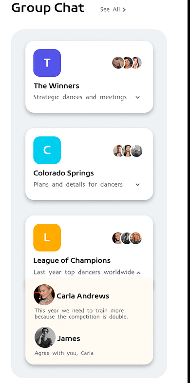
Dropdown icon
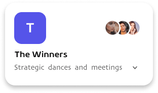
In the “Group chats” panel, the designer introduces cards that describe which groups the user belongs. The third card not only describes the group but also allows the user to see recent messages and threads within. But how will users know if other group chat cards offer the same feature?
Solution: I added arrow icons in all group chat cards. The icons give users a hunch about how it can expand if they clicked on it.
Conveyance
Finally, user interfaces must always convey to the user where they are and what they are doing in the interface. In the original design, there is a navigation bar that allows users to know their location within the interface. However, there should be more than one means to help users with this.
Solution: I added “See all” and “Read more” texts to both headers and event posts. Not only does it signify to the user that there is more to these features, but it also enables them to move through the interface smoothly and conveniently.

I applied for this opportunity because I want to grow and further my UX career. As a member of the She Code Africa community, I understand how beneficial this would be for me. I must also mention that the assessment did not request that I proffer solutions to the dashboard design. I did this because with the little knowledge I have about designing systems for people I saw the need to contribute to the existing design.